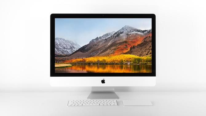
Serving retina images
Some screens are better than others, especially when it comes to pixel density.

I think the best place to start is with a simple question: what are pixels?
| Pixel type | Description |
|---|---|
| Device pixel | Smallest visible dot on a screen |
| CSS pixel | Physical size of 1/96th inch per 1 pixel |
Older computer screens have a pixel density of 1. The Windows default was, and CRT monitors had, a display resolution of 96 ppi (pixels per inch).
The result is 100px in CSS is 100px on the screen.
Then, LED monitors came in and Apple introduced Retina displays and that all changed.
I should mention that we’re not really serving Retina images – that’s just a marketing word from Apple.
We’re actually serving alternative images for display that are more pixel dense – whether an Apple Retina display or not – because other manufacturers caught up and make better displays too.
The first Apple Retina displays had a pixel density of 192 ppi. So now for some maths: 192 ppi divided by 96 ppi equals 2.
On these screens, 100px in CSS is 200px on the screen.
Now for background colours, borders, font sizes, etc. this doesn't matter. It just works.
But for images, you’re now showing a 100px by 100px image within a 100px by 100px container – but on the screen it’s 200px by 200px.
So we need bigger images. We need a 200px by 200px image and we need to show it at 100px by 100px for it to work on an Apple Retina screen.
But, we don’t want to use that bigger image for older devices because it’ll be a bigger file and it provides no benefit on older screens.
So we need a way of serving different images on different devices. You might think that’s difficult but it’s actually surprisingly easy.
What sizes do we need?
Compared to the size it will be shown in CSS pixels:
- An image of the same size
- An image twice the size
- An image three times the size
The last one is for the very latest screens.
How do I organise my files?
This one is up to you but the convention is to include the pixel density ratio or CSS pixel size in the filename.
image_name@2.jpg
How do I use the images on my page?
Here’s the HTML.
<img src="image_name@1.jpg" srcset="image_name@1.jpg 1x, image_name@2.jpg 2x, image_name@3.jpg 3x" />
The 1x, 2x and 3x describe the pixel density ratios. You add the image for that ratio and then a space before the ratio itself. Like this:
image_name@2.jpg 2x
Multiple images are separated by commas.
And in CSS?
This is imperfect and I don’t recommend using it. HTML offers the functionality with much shorter and easier to remember markup. It also offers you the opportunity to preload responsive images, in a way not possible below.
.background_image {
	background-image: url("image_name@1.jpg");
}
@media (-webkit-min-device-pixel-ratio: 2),(-moz-device-pixel-ratio: 2), (min-resolution: 192dppx) {
	.background_image {
		background-image: url("image_name@2.jpg");
	}
}
